
Color Psychology in Home Design
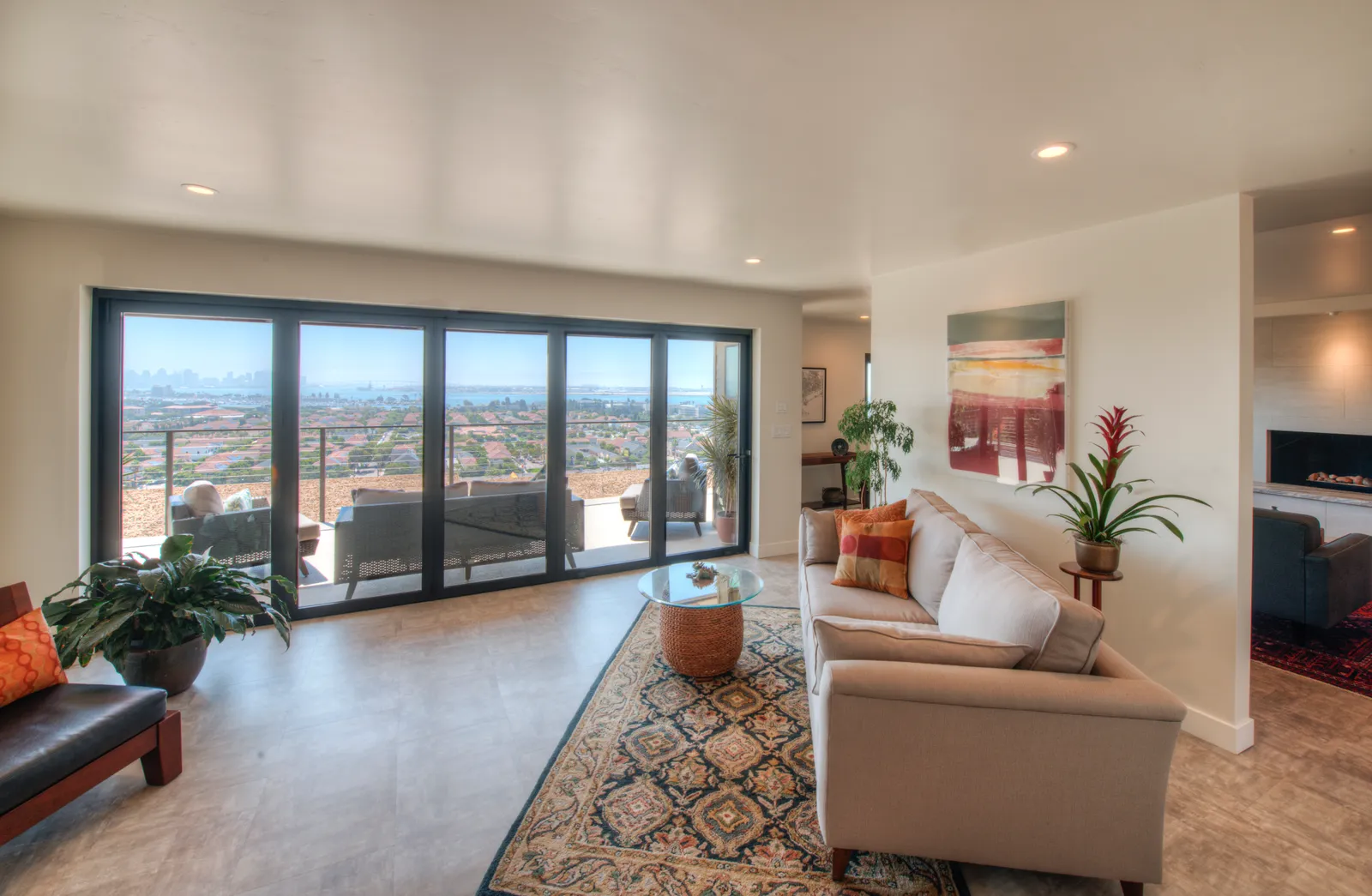
Walk into a room painted a soft blue-gray and your shoulders drop a little. Walk into one wrapped in warm terracotta and conversation gets louder. None of that is imagination — color genuinely changes how we feel in a space, and it's the least expensive powerful tool in all of home design.
But most of what's written about color psychology ignores the thing that matters most: light. And San Diego light is its own character. Here's how to think about color where the sun does half the work.
The broad strokes are real
Decades of research and centuries of intuition agree on the basics. Cool colors — blues, greens, soft grays — read as calm and expansive, which is why they dominate bedrooms and bathrooms. Warm colors — ochres, clay tones, warm whites — read as social and appetizing, which is why they gravitate toward kitchens and dining rooms. Deep, dark colors make a room feel enclosed and intimate; that's a flaw in a small kitchen and a feature in a den or a home bar. The mistake is treating these as rules instead of tendencies. The room's job, its light, and your own associations always win.
San Diego light changes the answer
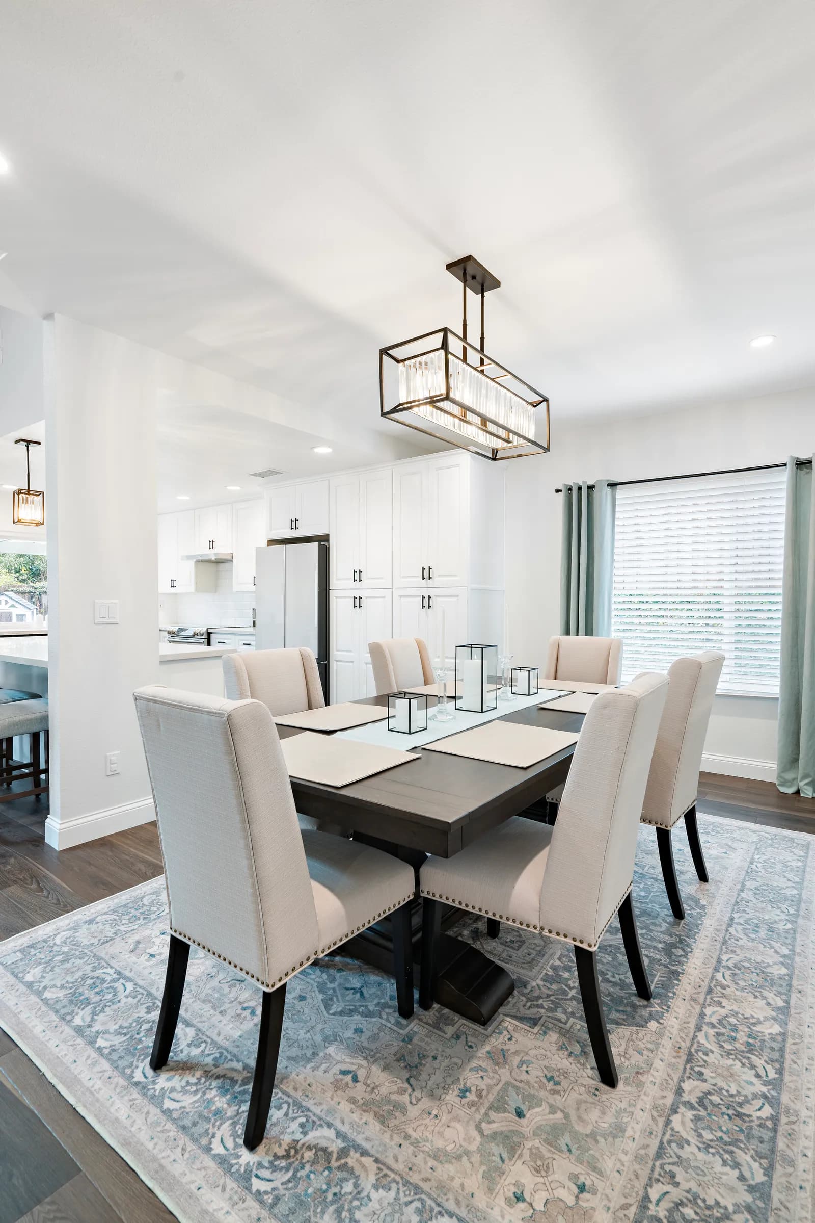
Here's the local twist. Our coastal light is bright but often cool and diffuse — the marine layer acts like a giant softbox for half the morning, especially in early summer. Under that gray-blue light, a trendy cool white can turn icy, and a gray sofa can go glum. Homes west of the 5 often benefit from warmer whites and earthier neutrals than the same house would inland, where El Cajon or Poway sun is yellower and harsher and can push warm tones toward orange.
Orientation matters just as much. North-facing rooms live in cool shadow and appreciate warmth; a west-facing room that catches blazing afternoon sun can handle — and calm down under — cooler, deeper color. This is also why paint and lighting decisions belong together: the same wall reads differently at noon and at 8 PM under artificial light.
Test like a professional
Whatever you're drawn to, audition it properly:
- Paint large sample boards — not the wall itself — so you can move them from wall to wall.
- Look at them at morning, midday, and night, under your actual bulbs.
- Judge color next to the finishes that will live with it: flooring, countertop, tile.
- Trust how a color makes you feel over how it looked in a photo of someone else's house.
Undertones are where most regrets happen. Two "greiges" can sit an aisle apart on the sample rack and behave like different species once the marine layer rolls in.
Color is a whole-house decision
The rooms people love most aren't the boldest — they're the ones where color flows logically from space to space, calm where you rest, warm where you gather, with a consistent thread of undertones tying it together. That kind of palette is easiest to build when you're already rethinking the spaces themselves. In a whole-home remodel, color gets planned alongside light, sightlines, and materials from the start, instead of being the last decision made under fluorescent lights at the paint counter.
For a deeper look, see Universal Design: Comfort at Every Age.
If you're dreaming in color this summer, we'd love to help you get it right the first time. Start the conversation or give us a call — we'll help you build a palette your home, and your mood, will thank you for.
Design · Build · Integration
Let's build something beautiful.
Call (619) 334-3322 or request your free design-build consultation.